Introduction
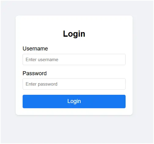
This code is a simple login form built using HTML, CSS, and JavaScript. It demonstrates the basic functionality of a login system, where the user enters a username and password to access the system. If the entered credentials are correct, the login is marked as successful; otherwise, an error message is displayed. This project is useful for beginners to understand how forms, styling, and simple validation work together in a web page.
Code Explanation
- HTML Structure
- The
<!DOCTYPE html>declares the document type as HTML5. - Inside
<body>, a login container holds a form with two fields:- Username (
<input type="text">) - Password (
<input type="password">)
- Username (
- A Login button triggers the
handleLogin()function when clicked. - An error message (
<p>with iderror-message) is shown if credentials are invalid.
- The
- CSS Styling
bodyuses flexbox to center the login form both vertically and horizontally..login-containeris styled with padding, rounded corners, and a shadow to make it look like a card.- Inputs and buttons are styled with hover effects and focus highlights for better user interaction.
.erroris styled in red and hidden by default, only appearing when login fails.
- JavaScript Functionality
handleLogin()gets values from the username and password fields.- It checks if the username is
"admin"and the password is"password123". - If correct → shows a success alert.
- If incorrect → displays the error message by changing its
displaystyle.
Features of This Login Form
- User-friendly interface with a simple and clean design.
- Responsive layout using flexbox for better display on different screen sizes.
- Basic form validation to check if the entered credentials match predefined values.
- Error handling that displays a clear message when login fails.
- Interactive styling with input focus and button hover effects.
- Lightweight implementation using only HTML, CSS, and JavaScript.
- Introduces the concept of authentication, although not secure for real applications.
<!DOCTYPE html> <html lang="en"> <head> <meta charset="UTF-8"> <meta name="viewport" content="width=device-width, initial-scale=1.0"> <title>Simple Login Form</title> <style> body { font-family: Arial, sans-serif; display: flex; justify-content: center; align-items: center; height: 100vh; margin: 0; background-color: #f0f2f5; } .login-container { background-color: white; padding: 20px; border-radius: 8px; box-shadow: 0 2px 4px rgba(0, 0, 0, 0.1); width: 300px; } .login-container h2 { text-align: center; margin-bottom: 20px; } .form-group { margin-bottom: 15px; } .form-group label { display: block; margin-bottom: 5px; } .form-group input { width: 100%; padding: 8px; border: 1px solid #ddd; border-radius: 4px; box-sizing: border-box; } .form-group input:focus { outline: none; border-color: #1877f2; } button { width: 100%; padding: 10px; background-color: #1877f2; color: white; border: none; border-radius: 4px; cursor: pointer; font-size: 16px; } button:hover { background-color: #166fe5; } .error { color: red; font-size: 14px; text-align: center; margin-top: 10px; display: none; } </style> </head> <body> <div class="login-container"> <h2>Login</h2> <div class="form-group"> <label for="username">Username</label> <input type="text" id="username" placeholder="Enter username" required> </div> <div class="form-group"> <label for="password">Password</label> <input type="password" id="password" placeholder="Enter password" required> </div> <button onclick="handleLogin()">Login</button> <p class="error" id="error-message">Invalid username or password</p> </div> <script> function handleLogin() { const username = document.getElementById('username').value; const password = document.getElementById('password').value; const errorMessage = document.getElementById('error-message'); // Simple validation (for demo purposes) if (username === "admin" && password === "password123") { alert("Login successful!"); errorMessage.style.display = 'none'; } else { errorMessage.style.display = 'block'; } } </script> </body> </html> Modern HTML Login Forms – Overlay, Card Designs & UI Styles (Related to HTML Forms)
Gradient Overlay Fullscreen Login Form:
This login form uses gradient overlays across the full screen to create a colorful and modern background. It improves visual appeal while keeping the login section clear and focused.
Read more: https://macronepal.com/blog/gradient-overlay-fullscreen-overlay-login-form/
Animated Fade-In Overlay Login Form:
This form uses smooth fade-in animations when the page loads. It enhances user experience by making the login interface feel dynamic and interactive.
Read more: https://macronepal.com/blog/animated-fade-in-overlay-fullscreen-overlay-login-form/
Light Glass Look Fullscreen Login Form:
A soft glass-style UI with light transparency and blur effects. It creates a clean, elegant login interface with a modern aesthetic.
Read more: https://macronepal.com/blog/light-glass-look-fullscreen-overlay-login-form/
Dark Blur Overlay Fullscreen Login Form:
This design uses a dark blurred background overlay, helping the login form stand out while giving a professional and modern dark UI feel.
Read more: https://macronepal.com/blog/dark-blur-overlay-fullscreen-overlay-login-form/
Floating Card Login Form (HTML, CSS, JS):
A floating card-style login form that appears elevated above the background using shadows and positioning effects for a 3D-like look.
Read more: https://macronepal.com/aws/floating-card-login-form-in-html-css-and-javascript/
Gradient Card Login Form (HTML, CSS, JS):
This login form uses gradient backgrounds inside a card layout, making the interface visually attractive and modern.
Read more: https://macronepal.com/blog/gradient-card-login-form-in-html-css-and-javascript/
Image Background Card Login Form (HTML, CSS, JS):
A card-style login form placed over an image background, combining visual storytelling with functional login design.
Read more: https://macronepal.com/blog/image-background-card-login-form-in-html-css-and-javascript/
Split Card Login Form (HTML, CSS, JS):
This design splits the login card into two sections, often with an image on one side and form fields on the other, creating a balanced layout.
Read more: https://macronepal.com/aws/split-card-login-form-in-html-css-and-javascript/
Glow Neon Card Login Form (HTML, CSS, JS):
A futuristic login form using neon glow effects around the card, giving it a cyber-style appearance suitable for modern UI themes.
Read more: https://macronepal.com/blog/glow-neon-card-login-form-in-html-css-and-javascript/
Neumorphic Card Login Form (HTML, CSS, JS):
This design uses soft shadows and highlights to create a realistic 3D “pressed” effect, known as neumorphism.
Read more: https://macronepal.com/blog/neumorphic-card-login-form-in-html-css-and-javascript/
Glassmorphic Card Login Form (HTML, CSS, JS):
A glass-like transparent card design with blur effects, widely used in modern web UI for clean and elegant interfaces.
Read more: https://macronepal.com/blog/glassmorphic-card-login-form-in-html-css-and-javascript/
Simple Card Style Login Form (HTML, CSS, JS):
A basic card-based login form with minimal design, focusing on usability and clean layout without extra effects.
Read more: https://macronepal.com/blog/simple-card-style-login-form-in-html-css-and-javascript/
Simple Login Form (HTML, CSS, JS):
A straightforward login form with essential fields like username and password, built using basic HTML, CSS, and JavaScript for easy implementation.
Read more: https://macronepal.com/blog/simple-login-form-in-html-css-and-javascript/